

Starting from Scratch
Somniphobia was a super fun game to work on, but not without its fair share of development problems. One of the first big ones was we had no artist on the team. My initial focus was sourcing assets from the Unreal Engine marketplace.
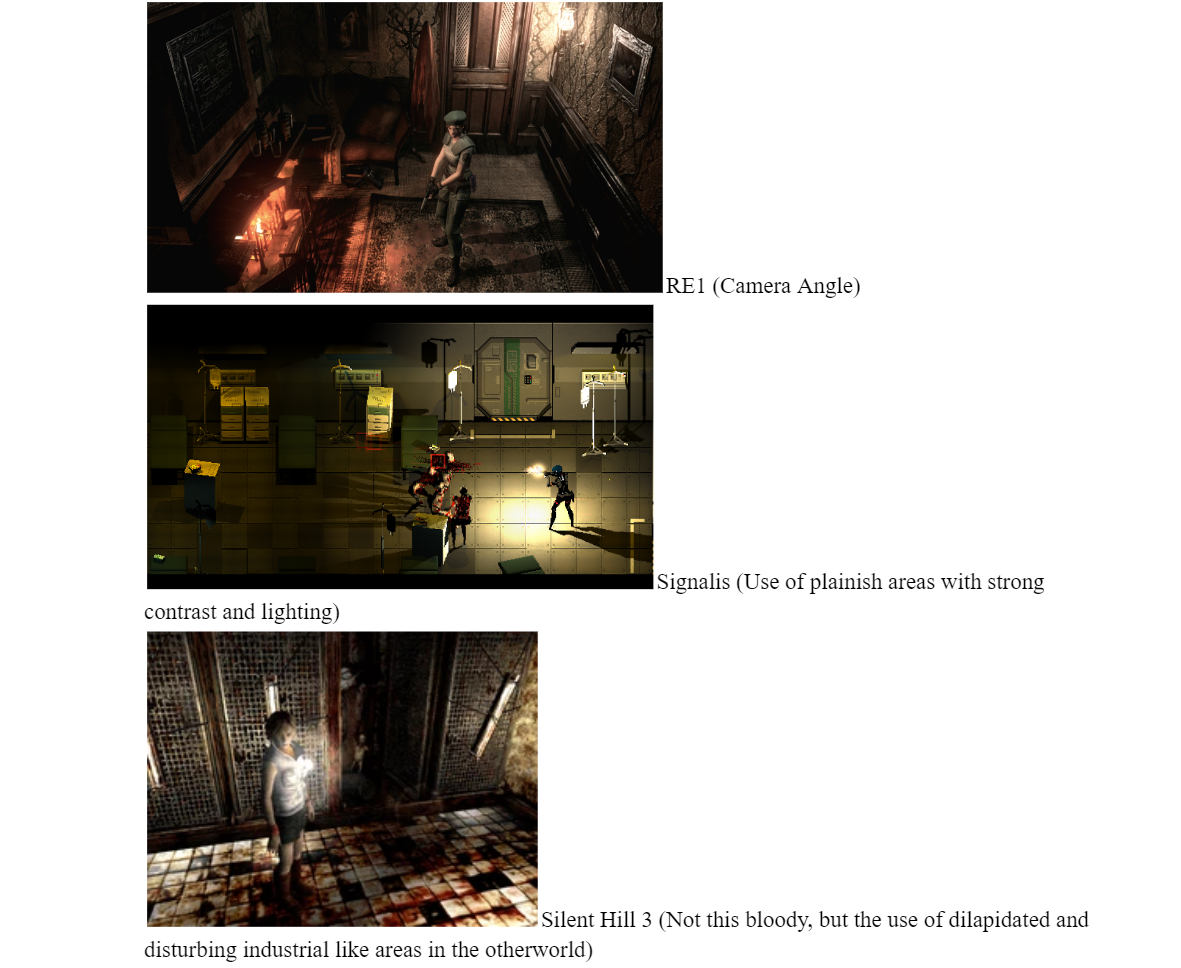
We took the list of reference games our creative director came up with and went looking through the marketplace for free assets that fit that theme. Some of the games we pulled direct influence from are Resident Evil 1, Signalis, and Silent Hill.
By only using marketplace assets, we came across another major problem to solve. Not all of the assets we could find had a unique unified theme. Whether they had different texture qualities or differing art styles, our environments would clash with themselves every time we tried to make new levels.
After looking through our references, we found that the best solution was to add a filter over our game and give it a PSX feel to fit with the rest of the retro feel and gameplay.

Inventory reference I used Credit Rose-Engine


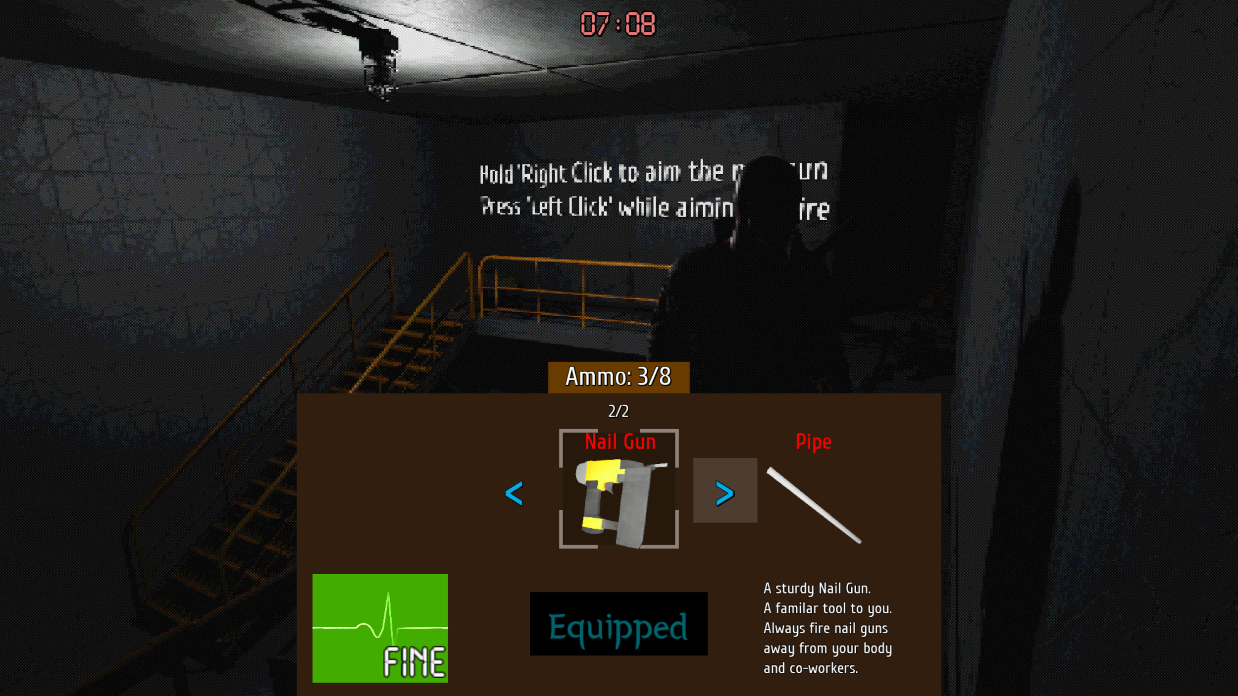
Once I got design approval, I started to work on the actual functionality of the inventory with some of the programmers on the team. While I didn’t program much of the backend of the system, I primarily focused on getting all of the buttons and forward-facing bits of the inventory as functional as possible.
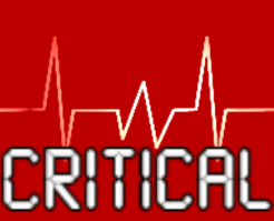
One of the interesting problems I encountered while setting everything up was how to create a functional EKG effect (The heartbeat pulse effect that acts as the player’s health bar). After looking online to see if anyone else had done it, I found one tutorial on YouTube that simulated the effects with materials. This is something that I had never used before in my time in UE5. Thankfully, I was happy to learn an entirely new system and followed the tutorial to make my own EKG effect. After a bit of fiddling, I was happy with how it looked and hooked it up to the health bar so it would change states depending on how healthy the player was. This gave me a ton of helpful experience with materials that I still use to this day.

Somniphobia
Somniphobia is a classic, fixed-camera, survival horror game with rogue-like elements, where the player is trapped in a reoccurring nightmare, the only way to stop the cycle is to get out before you wake up, otherwise, it resets with slight changes. Somniphobia has traditional survival horror elements such as combat and item collection, as well as rogue-like elements where the item, enemy, and room placement will be different every run/night.
Somniphobia is an Unreal Engine 5 school project I worked on for over a year with 9 other members of the team [Ad Space Reserved]. I was the art director and UI designer for the project.
Development
One of the big ideas of having an intentionally obscured health state was to keep the player constantly guessing and increase the tension
The first iteration of the prototype Inventory Screen
After getting all of the functionality in the beginning
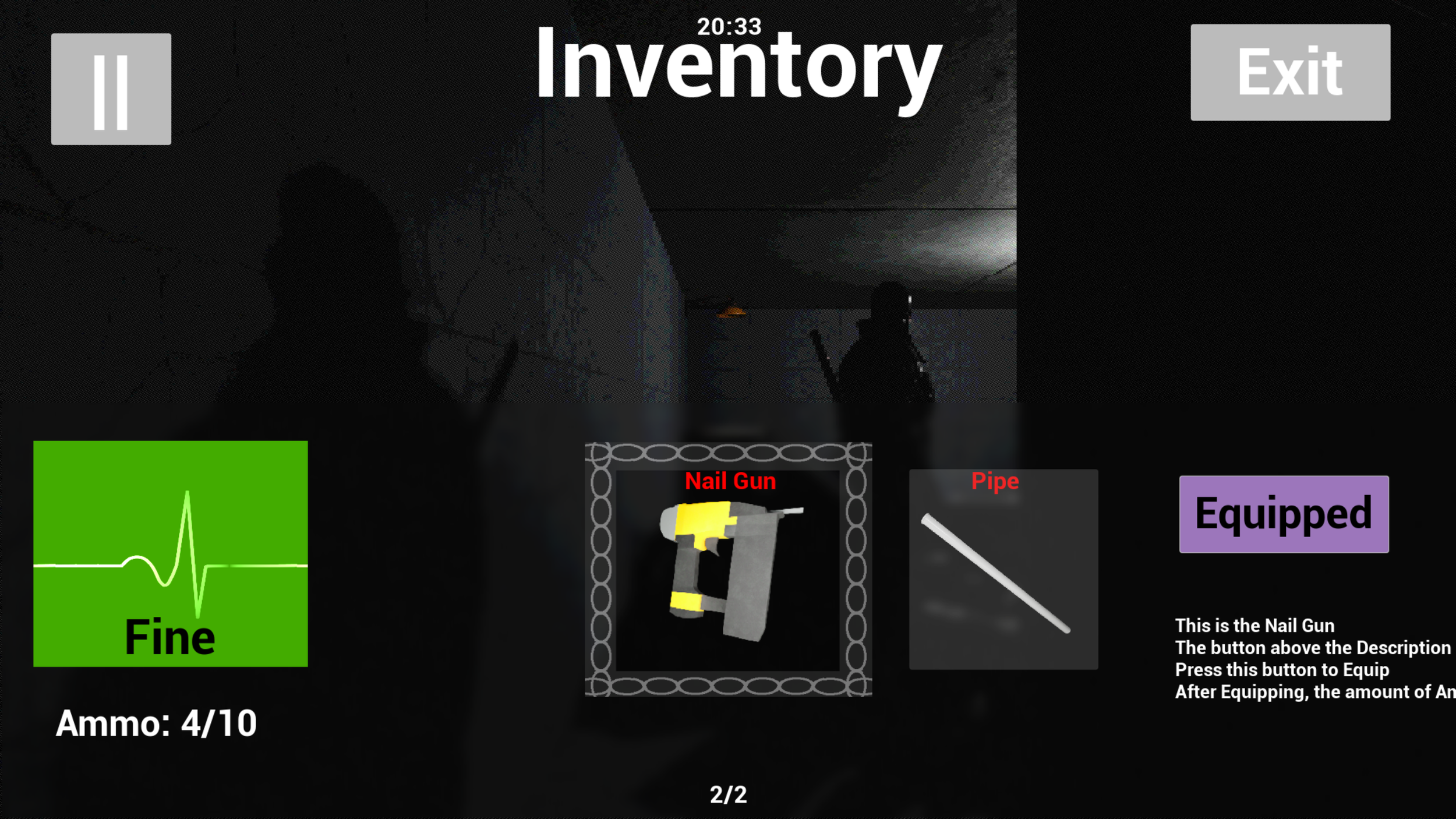
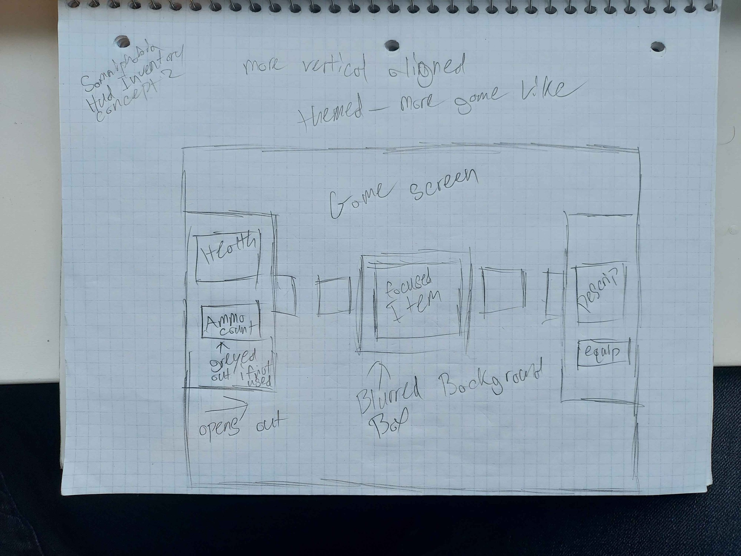
For a long time, this layout worked quite well, it allowed us to have all of the essential parts of our inventory displayed with plenty of free space for all of the items and description text. However as the game changed throughout development, the needs of the inventory changed, and I had to go back to the drawing board to create a screen that would satisfy an important goal to enhance our experience.
My main goal was that the screen needed to take up as little space as possible, to give the player an unobstructed view of what they were currently doing. A big part of our game is the timer you can always see on the top of the screen. Once that timer reaches the end, an alarm plays and you wake up in a cold sweat doomed to repeat the nightmare you just went through until you can find your way out and beat the root of it all. However, the timer never stops, no matter if you are sorting through your inventory, entering codes, or running to find the next key item. This meant that the inventory had to obstruct very little of the player, as we gave players the ability to constantly be moving to fight against the never-ceasing timer.
After a good bit of research into other games, I came up with two different designs. One based on our current inventory look and one that completely changed the layout. Both had their pros and cons, but after a team vote we decided to go with the one based on the current inventory, but slim it down quite a bit and theme it after a backpack.
The main goal with this design was to provide an overall sleeker look in a smaller footprint while theming it to look like a backpack
This alternative design theme for this one is a utility belt, as our main character is a construction worker
Final layout for the inventory
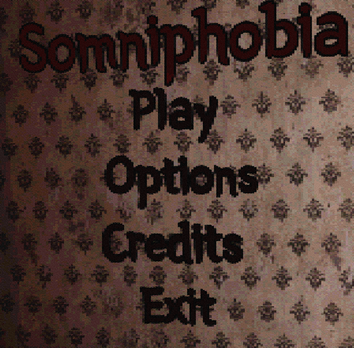
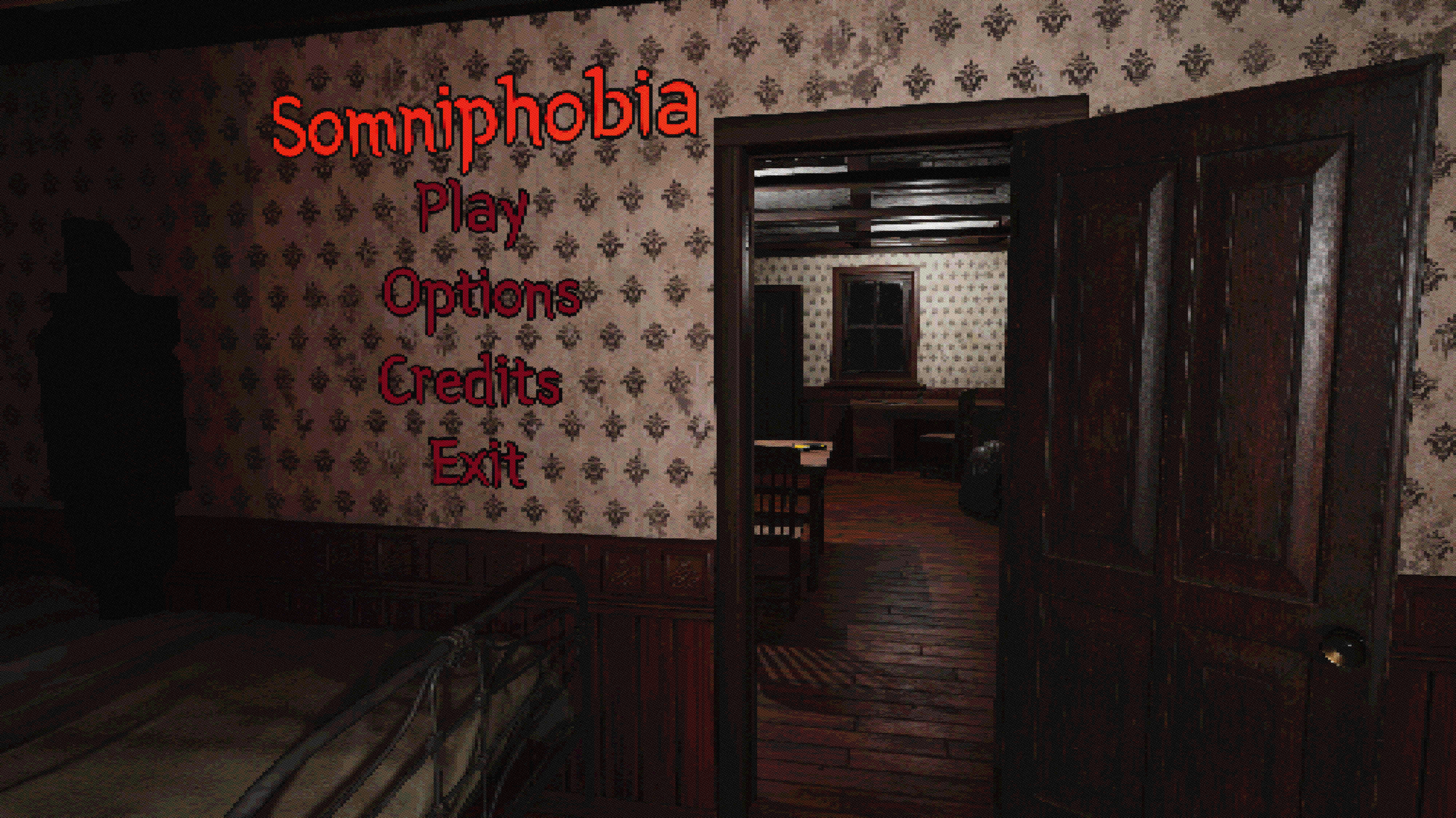
Next on the chopping block is the title screen. I wanted to try and make the title screen diegetic, partially as a challenge to myself since I had never done anything like that before, but mostly because I thought it would lend to a more immersive game experience while still looking quite cool.
First things first, I had to figure out how to do any of this in the first place. After a good bit of Googling, I found this tutorial by the YouTuber Ivica that details all of the steps of how to convert normal widgets to blueprint widgets so you can place them anywhere on your level. It comes with a couple of quirks that I would have to resolve later.

First prototype start screen
Step two was to start working on the scene for the UI to sit on. We already had a tutorial level with an established look that started at the beginning of the game. Using that level as a reference, I grabbed a ton of the same environmental models and created a basic bedroom with a doorway leading into a dining room. The goal was to show the player what the main character’s apartment looked like every night he went to sleep. After a bit of playtesting, I added an enemy somewhere in the room (feel free to try and find it) and a flickering light in the background to introduce more motion to the composition.
Ad Space Reserved Team
Final title screen look
Last on the list were all of the weird quirks that come from 3D widgets, color palettes, and font choices. For color, I wanted to pick something that would stand out against the beige of the wallpaper but still screamed horror game at first glance. After a bit of deliberation with the team, we decided to go for a bright bloody red as it contrasts nicely with the background as well as being heavily associated with the horror genre. Next was fonts, I went through many of the free font websites and settled on Yeon Sung. After confirming with the team, I went and used it to fill out all of the text in our game. Sadly I realized when going through the options menu that for whatever reason, the Yeon Sung font has incredibly large spaces between words. I had no clue if I could edit that somewhere, but I ended up creating a hacky workaround using some vertical boxes and individual words. Due to project time constraints, I used a different font to use for our inventory.

One space in Yeon Sung
The final thing I worked on was creating a new material to make all of the 3D widgets slightly emissive. This was super important because, without that material, all of the text in the game would look like the image below.
Which, as it turns out looks quite bad. I was quite glad to have the experience of messing with materials before as it helped out quite a bit when tuning all of the 3D widgets.
Final thoughts
Overall I am super happy with the work I did on Somniphobia. It was great to work with the team [Ad Space Reserved] and I learned many important lessons. I had initially designed a lot of the UI without even thinking about button states and animations, but as time progressed I realized the importance of UI feedback.
There were several moments throughout development when we did playtests and realized that something just didn't work right. One of the big ones was our combat. Playtests revealed that combat felt clunky and not intuitive, so we all got together as a team and talked out ideas. After a good bit of deliberation, we came to a consensus with the changes we thought would improve the overall experience of our game. It was moments like these that made me feel at home with the team. We felt like a well-oiled machine that could overcome any challenge if we all got together and worked it out.
After a year of constant development, I learned so much. From widgets and HUDs to materials and animations, I improved massively. Plus I now know a bunch of amazing programmers and designers I can look to in the future for feedback and thoughts.
Final title screen
With our visual style decided and our assets found, I moved to start prototyping all of the menus and UI for our game. I started by looking at our references and specifically took images from Signalis and Silent Hill 2’s inventory screens to influence how to design ours.
With those as a base, I initially prototyped the design using Figma so I could test out the functionality of the HUD and get approval/feedback from other team members.