

My work
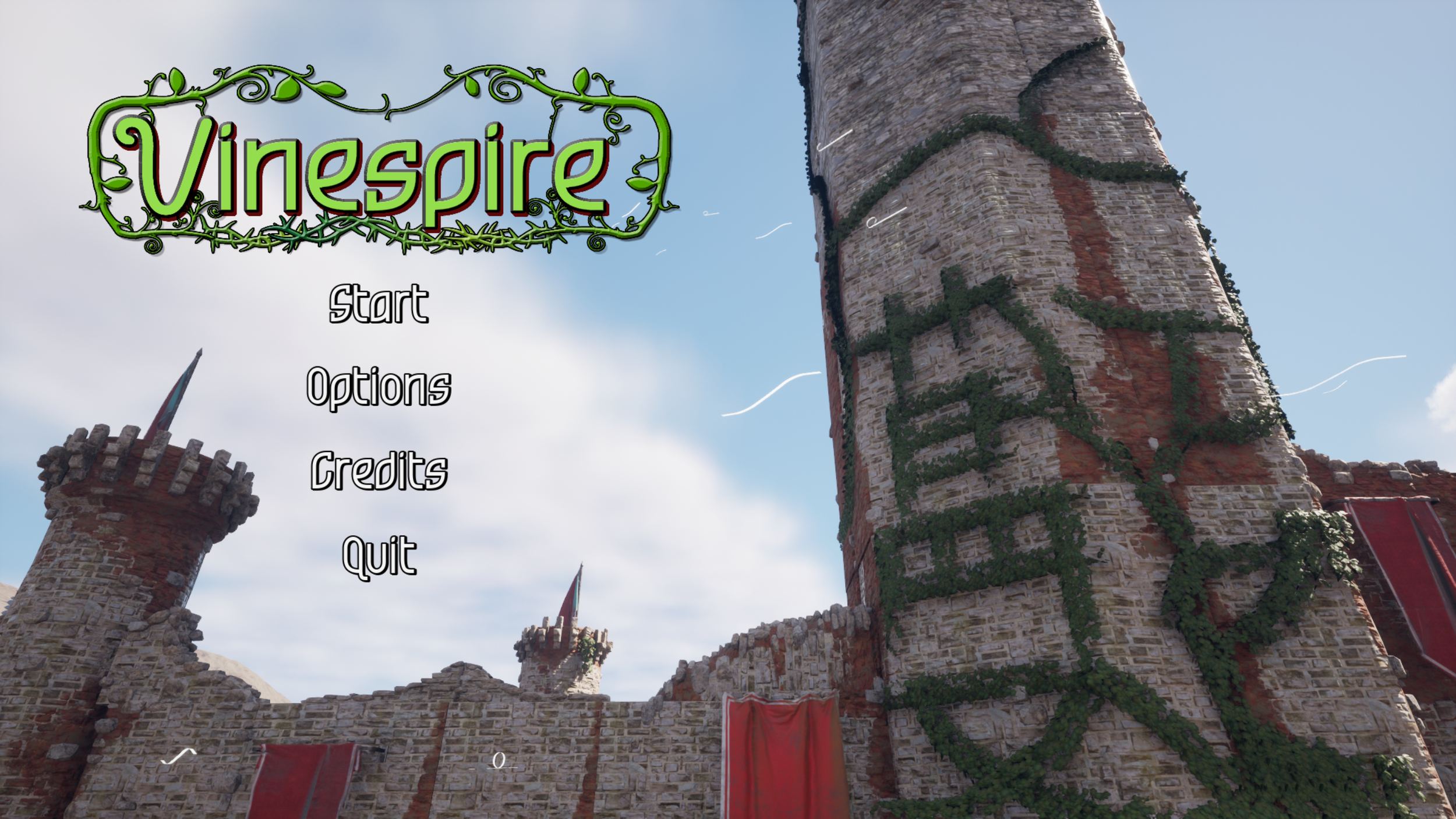
Created a diegetic main menu UI and background scene.
Prototyped inventory screen using Figma and paper.
Implemented a full inventory system with a custom health display.
Created all menu screens including options and credits.


Somniphobia
Somniphobia is a fixed-camera survival horror game created in Unreal Engine 5. it was worked on for over a year with 9 other members of a team. I created and refined all of the game menus including a diegetic main menu screen, and a dynamic inventory.
My Roles
UI/UX Lead
Art Lead


Prototyping

Release Screen
Final polished starting screen.
Final polished starting screen.
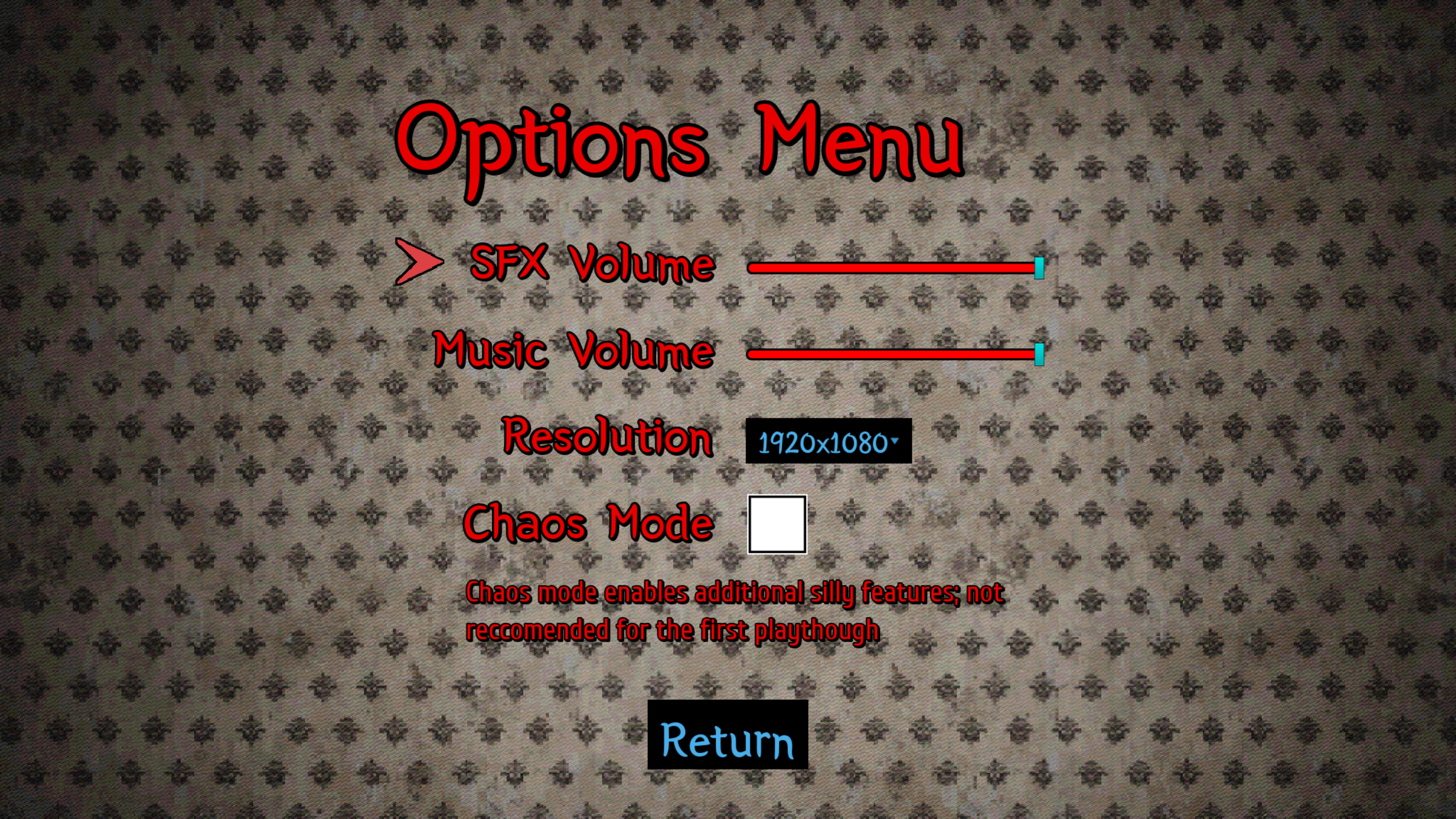
Finalized options screen.


The inventory from Signalis, one of the primary emulation targets for our game.

The first prototype inventory, designed to still give the player a view of their surroundings, as the game did not pause while it was open.
Implementation
Implemented prototype into Unreal Engine 5 Widgets
Created and implemented all of the user-facing UI
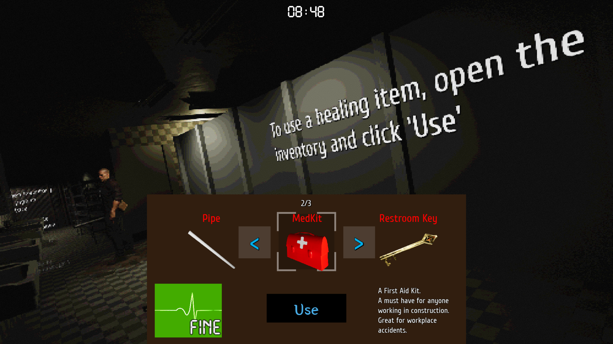
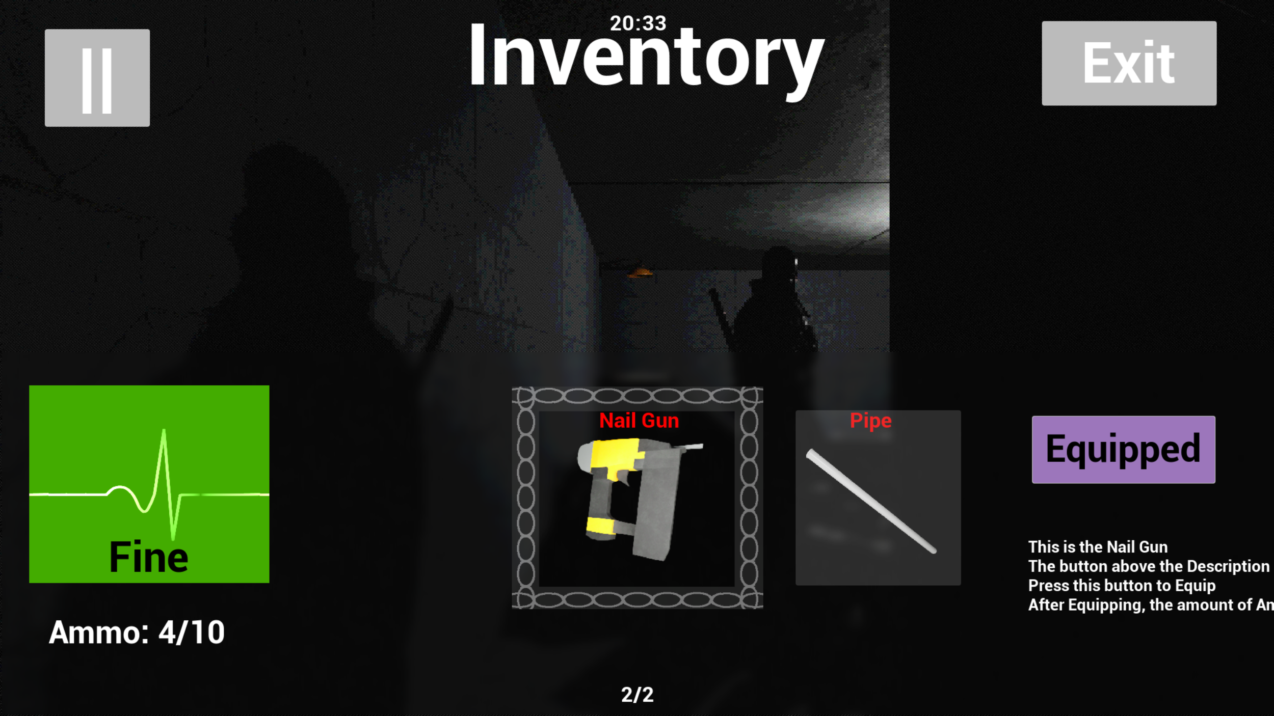
Created the dynamic health display, which changed depending on the player’s health with Unreal Engine materials.

The inventory in action, right after combat to show off the obscured health system with the accompaning vignette.

The First pass on the inventory. Initially, it worked well, but through playtesting, we discovered it needed to be refined.
Created the background scene by pulling references from the tutorial of the game
Created and implemented 3d widgets into the scene.
Used prior knowledge of materials to make the text glow and pop out against the background.
Implemented motion in the scene through the use of flickering lights to make it more engaging.
Features
We wanted to have an obscured health in the game, partially because it kept the player constantly guessing therefore increasing the tension of each combat.

The First
Was a simple redesign, that combined elements of the first prototype, but shrunk the look. Designed to emulate a backpack in style, pulling from emulation targets.
My process
Redesign
We encountered a couple of problems later in development that required a redesigned inventory. Primarily, the current inventory took up too much screen space.
To solve this problem,
I came up with 2 new prototypes that reduced the amount of screen space the inventory occupied.

Title Screen

Reflections
Overall I am super happy with the work I did on Somniphobia. It was great to work with the team [Ad Space Reserved] and I learned many important lessons. I had initially designed a lot of the UI without even thinking about button states and animations, but as time progressed I realized the importance of UI feedback.
There were several moments throughout development when we did playtests and realized that something just didn't work right. One of the big ones was our combat. Playtests revealed that combat felt clunky and not intuitive, so we all got together as a team and talked out ideas. After a good bit of deliberation, we came to a consensus with the changes we thought would improve the overall experience of our game. It was moments like these that made me feel at home with the team. We felt like a well-oiled machine that could overcome any challenge if we all got together and worked it out.

The Second
Was a complete redesign of the concept from the ground up. I changed it to look more like a utility belt to reflect the characters construction worker background.

The first test of the title screen. I felt like it needed more motion to keep the player engaged.
Final implementation of the title screen. Initally the buttons on the wall could barely be seen. Used materials to make them glow in the dark.
Final Thoughts
Worked with the creative director to understand the function of the interface.
Created Figma and paper prototypes to test ideas before implementation.
Implemented the prototypes, learning Unreal Engine 5 widgets and materials along the way.
Solved design problems by creating a new layout for the inventory
Set the mood of the game with the start screen, font, and color choice.
After some deliberation,
the team decided to go for the first design. It took up less of the screen and tested better.
3 different prototypes for the inventory
A heart monitor style health display
The main menu screen
The options menu
The pause menu
The credits
Prototype Screen

The initial starting screen with a finished background.

Figma prototype inventory screen.
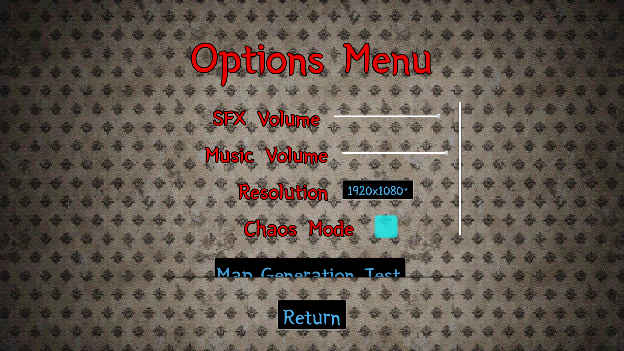
First inital draft of the options screen.

Worked with the creative director to find a list of emulation target games as I was unfamiliar with the genre
Researched emulation targets to inform prototype
Created first prototype using Figma
Playtested prototype to find weaknesses in the design
